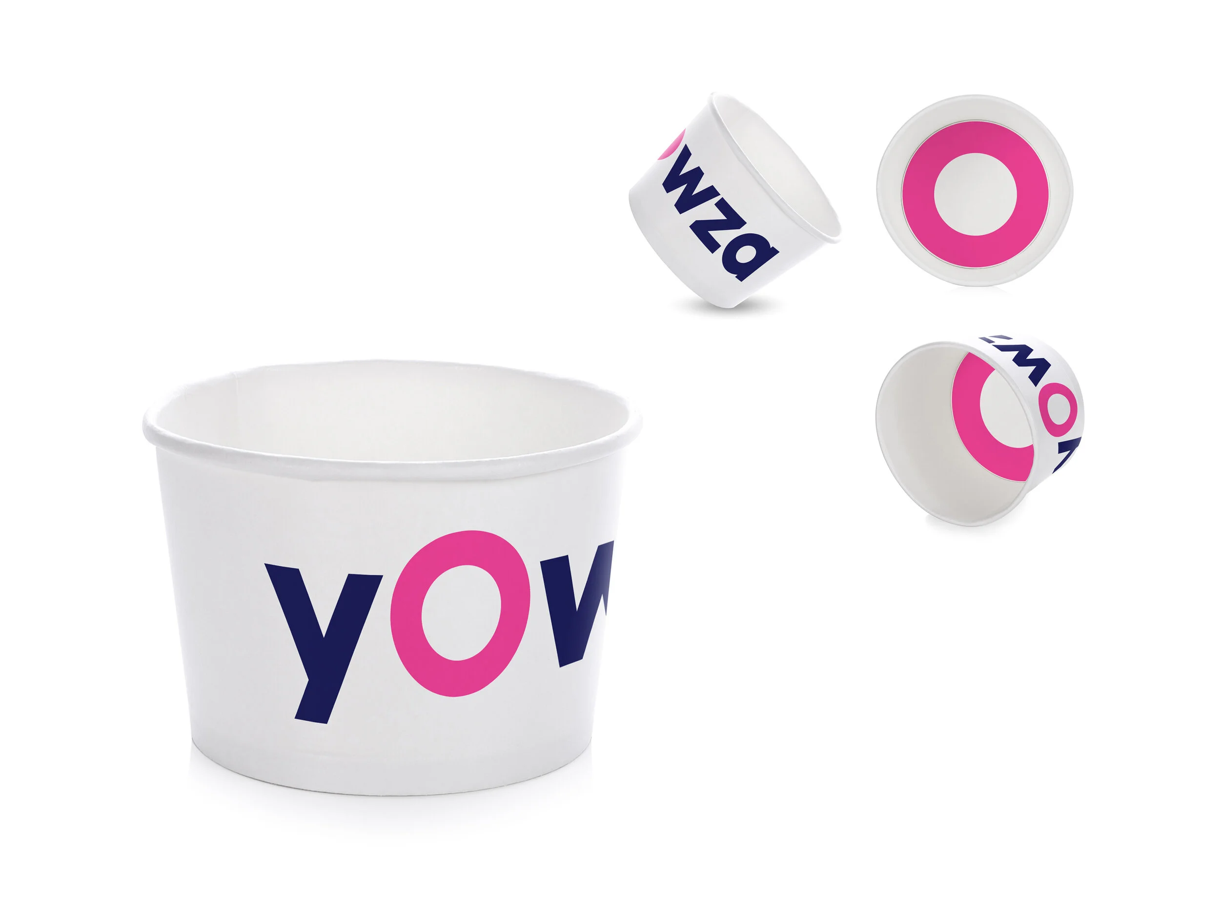
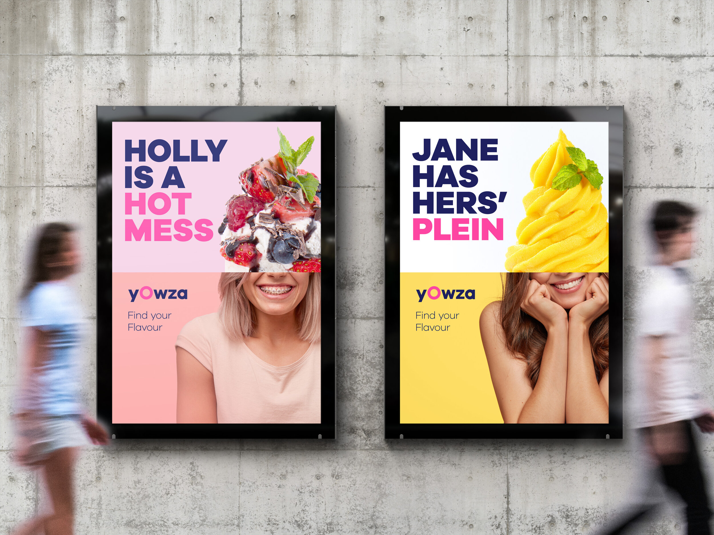
Yowza
Bringing life to a frozen yogurt brand where customisable toppings are the main USP - showcasing the versatility of the product with a bold ‘O’ which can be perceived as an empty tub, an open mouth, or a gasping emoji. In motion, the Yowza O transformed into various products, while in print & digital marketing disruptive design was used to showcase the eclectic mix of various customers, toppings and flavours.